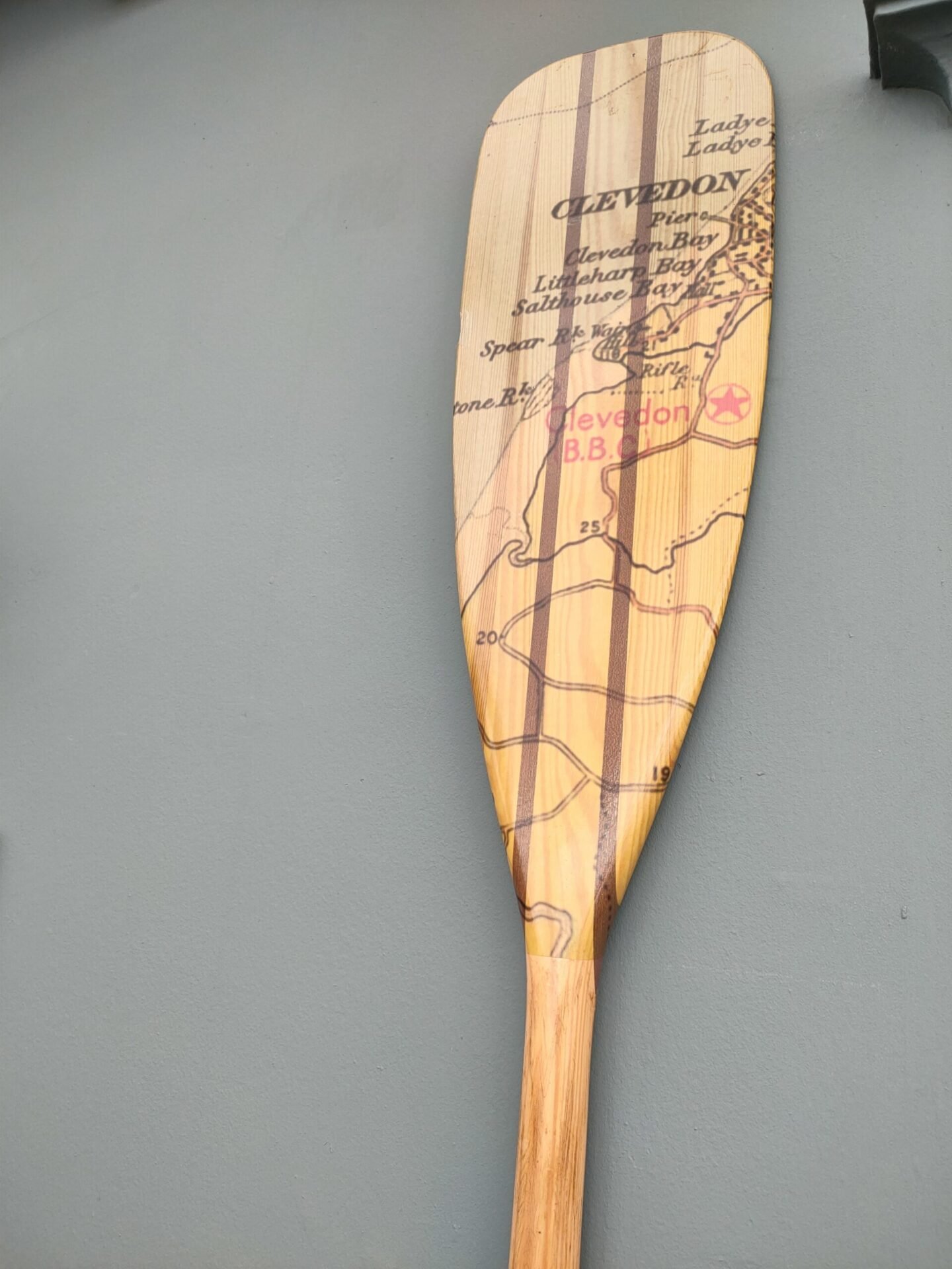
Yesterday, we went on an outing to the Magnificent Maps of London exhibition at the London Metropolitan Archive, it is open until the end of March and is well worth a visit but in case you can’t get to it here are a few highlights. I know that some of our more precise followers will question whether these are actually maps in the wild, maybe some aren’t but if you are the editor you get a free-ish choice!
The picture below doesn’t do the map justice, the cartography is exquisite. Islington, by Edward Baker, 1793, published by Benjamin Baker.

This is where Donna and I used to live 35 years ago, it also shows the beautiful detail on the map.

Of course an exhibition of historical maps of London would not be complete without the Charles Booth Map of Poverty in London(1889-91), they had a nice excerpt from the map blown up and also an interactive version that you could scroll around.

They also had a slightly later study of the Jewish population of the East End of London (1899) by George Ariel who had worked on Booth’s survey, you can see the similarity.

And in the same style a map of bomb damage to London that was continually updated by the London County Council between 1939 and 1945

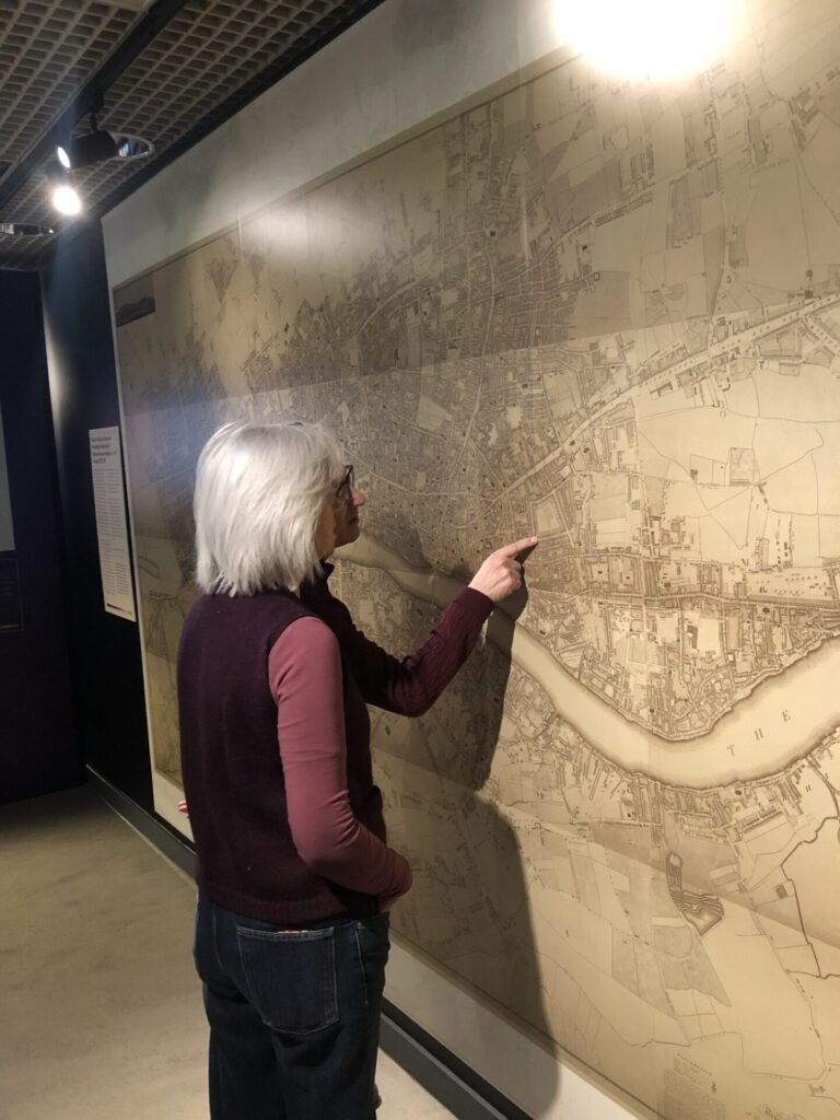
Donna and our friend managed to find where their grandparents had lived on this late 18th century plan map (though not that long ago).

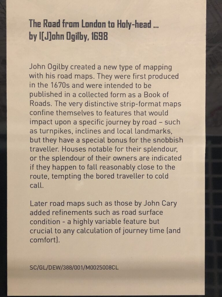
I loved this strip map, particularly the way the north arrows are rotated.

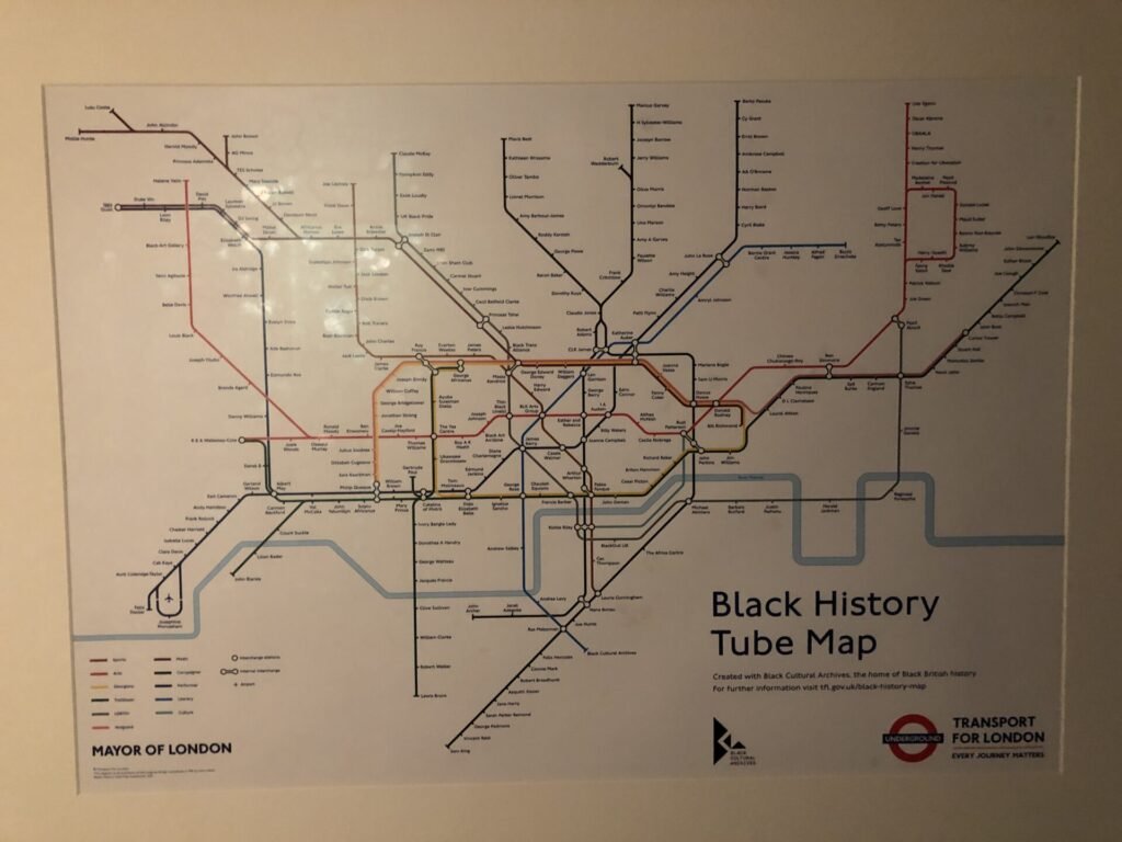
And finally for those of you like a bit of Becksploitation, here is what I consider to be one of the most egregious examples of misusing Beck’s diagram. I cannot see any justification for using this design to highlight the contributions of black people to London when it does not represent where they lived or worked. Of course they should be celebrated by Londoners but just not with this awful and meaningless map.

There is loads more here for map lovers, if you have an hour near Clerkenwell then I highly recommend a visit (no booking needed but check opening hours).


